

Login is possibly the most boring afterthought of any design project and it’s possible that you won’t read past this sentence as a result.
Still with me?
Good. Login is easy and has nothing to do with the amazing product you’re designing. And after designing dozens of other screens over the last six months, you can’t be bothered with this screen. “The hard work is behind me, just slap a standard login in there and leave me alone.” (If you’re not saying it, you’re thinking it.) The only good thing about login is that secretly you love when a sprint is devoted to something like this because then you can throw something together on the Tuesday evening before sprint grooming then call in sick for the rest of the week.
Yes, the login is fairly straightforward. And with most users comfortable staying logged in, it’s likely that many users won’t even see it. But there are times when they will see it — logging in for the first time, or the first time in a loooong time — and your login screen shouldn’t disorient or confuse them. This can’t be the first time they see the crazy new marketing campaign featuring a dancing lobster, but it also can’t look like a generic system screen causing a user to think they’re on the wrong site.
My goal in this article is to prove there’s more to this pattern than you think and that it’s worth giving it some attention. You can still take that sprint off, but I’m going to give you some patterns to make sure what you throw together is a better login experience.
Here’s a quick reference for the patterns I’m going to cover:
- Focused: Login takes sole focus, with no additional details given to marketing or advertising.
- Multi-Account: A focused login for a service that supports multiple accounts
- Nested: Login takes focus, but it is framed within the marketing site.
- Marketing-Forward: Login is often placed alongside the product marketing site.
- Billboard: Login uses the page to advertise other services.
After showing examples of these patterns, I’ll wrap with considerations and principles.
Login Patterns
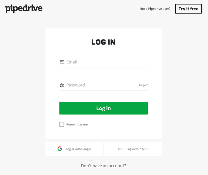
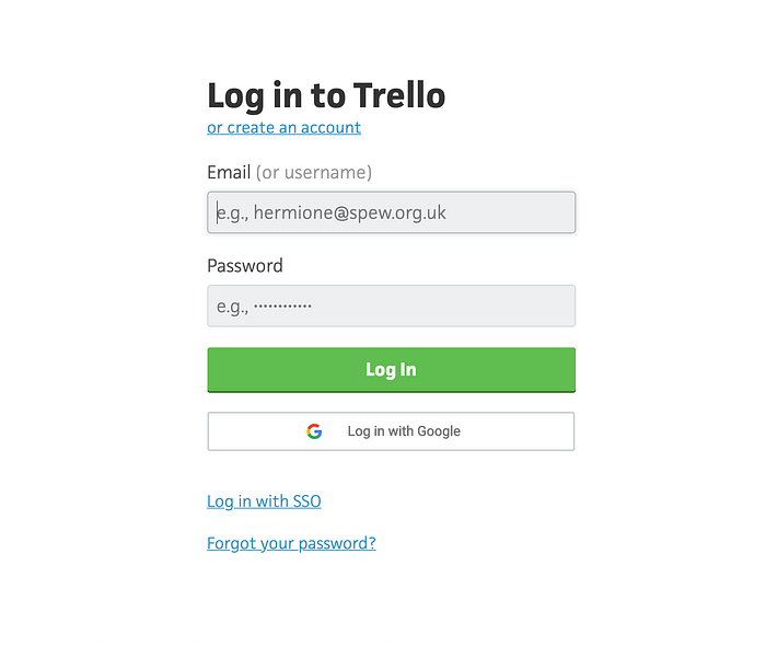
Focused
Now we get into the more traditional approaches to login. In these cases, login is its own page.
Pipedrive
Trello
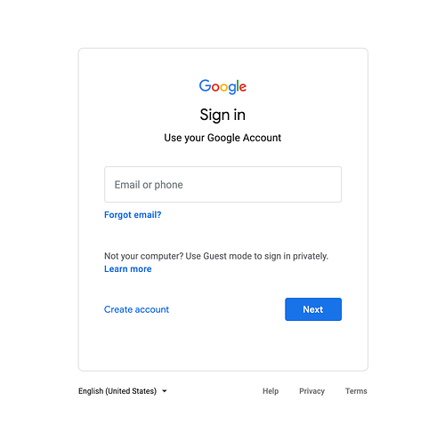
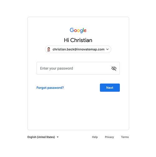
Multi-Account
Google allows many accounts. To accommodate this, they separate email from password:
Slack
Arguably the most common example of this pattern is Slack. I didn’t include it because I find their execution to be poorly executed. Slack supports logging into different workspaces with different emails, but these are managed poorly. Any time I get logged out of my main company workspace, it’s a journey figuring out how to log back in and then figure out which workspaces are tied to which email. I’m Slack’s #1 fan, but I felt obligated to point out why they were omitted.
Nested
This type of a focused login nests login within the broader site. Unlike the Marketing-Forward pattern, this actually wipes away the site content but leaves the site navigation unchanged.
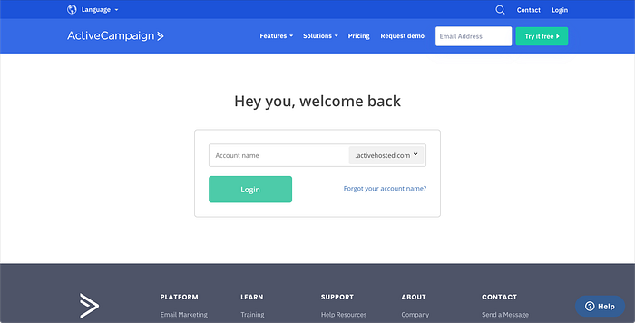
ActiveCampaign
The header and footer stay the same, but clicking “Login” will cause a login to appear in the content area:
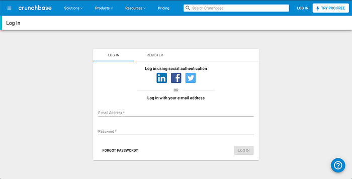
Crunchbase
Similar approach here, but with an additional “Login” bar nested under the navigation (a fairly clunky execution, to be honest):
Marketing-Forward
Dropbox
Dropbox seamlessly ties the login with the broader Dropbox homepage:


In a less elegant, but identical approach, LinkedIn also defaults to the login popup being active if you happen upon their marketing site:

Billboard
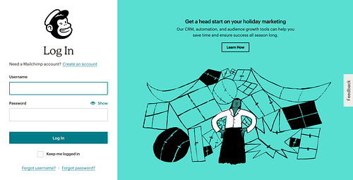
Mailchimp
Mailchimp uses login as a way to not only reinforce their branding through their logo and illustrations, but also markets new features with a CTA link:

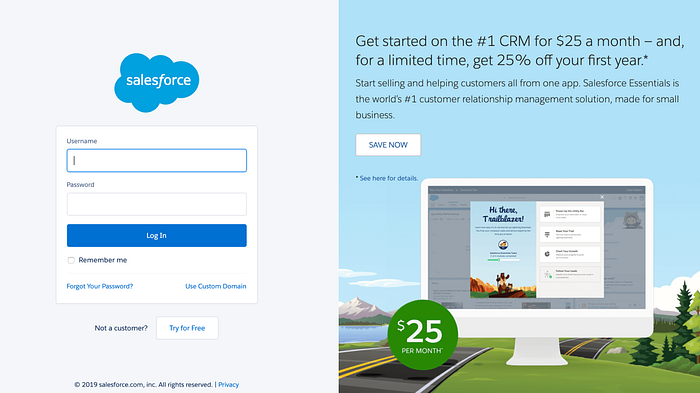
Salesforce
Here, the space is used quite literally like an ad:
Considerations
Language
Is it “sign-in,” “log-in,” “log-on”, “login”, or “logon”…are you using hyphens? of course these aren’t the only ways to use language but they set a tone — as do all the other words you choose to include on your page.
Logging in with other services
Ultimately this decision may be out of your hands but I think it’s worth weighing in from a UX perspective. There’s no doubt that using Google or Facebook make logging in easier. But they come with their own security baggage.
More importantly, they may not be something your users want to login with. As a result, it’s not enough to simply skimp on designing a login knowing people will use other services. And with with password managers gaining popularity, auto-filling makes everything a bit smoother.
Can non-users see this screen?
In the examples I’ve provided, they all assume any user can see the screens. Either they are tied to the company’s marketing site (like Dropbox), or they simply want the screen to also link users to register (Pipedrive). But it’s useful to know who and how someone will see this screen to know whether it needs to pull double duty.
Login frequency
I haven’t seen LinkedIn’s marketing page in years. Other services like MailChimp, I see regularly because they log me out automatically. As a result, companies like MailChimp use the login to upsell or teach because they know users will see the screen. The greater the frequency a user will see the login screen, the greater the opportunity to use the page as a billboard.
User Name vs. Email
I’m not sure the technical details behind this but it’s worth pointing out how often services and apps are abandoning user names for emails (and SSO, and other authentication methods). For multi-account sites like MailChimp, a user name is helpful because it can be used across multiple email accounts (an approach that Slack should utilize). But for most other cases, an email is a better experience because it’s one less thing a user has to remember.
Principles
Tie the login screen to your product branding
For most people, logging in is like getting locked out of your house. Imagine staying logged in and not seeing this screen for months until IT makes you clear your browser cache because “Gmail is acting wonky.” You are greeted with a login screen that looks nothing like the app you are used to using. Not only are you locked out but it’s like someone repainted your door. Login should always make a user feel at home.
One screen or less…
I’m typically hesitant to make this bold of a principle but I can’t see any reason a login must have multiple screens. The “less” part comes from the pseudo-single screen case where you add a contextual field in the same page. Sometimes this is necessary if you have multiple accounts (like Google). But not forcing a refresh and handling in page makes this a quick experience.
…unless you support multiple accounts
In these cases, it’s better to separate email or user name from password so that you give the user a pause to remember what account they are logging into. In the case of shared accounts like MailChimp, you can combine user+password, then handle account selection on the second screen.
Security first, marketing second
It can be attractive for marketing departments to upsell existing customers by utilizing the login screen. As a result, it can be tempting to force user sessions to end, just so a user will see an ad. But user experience is also a big part of customer satisfaction and continually logging a user out when the security implications are trivial is not a great experience. Security, and user experience, should trump marketing when it comes to login.
I hope I have belabored a seemingly simple UX pattern enough that you appreciate the intricacies of the login flow. Login is not something users will often see, but it’s worth putting thought into because it’s a rare connection between the brand and experience of most digital products.


No Comments on this Post.Be the first