The Tried and True Laws of UX [Infographic]
Remember when your mother warned you not to run down the stairs because you could fall and hurt yourself? Or when you held your palm over a candle’s flame and started feeling the burn? The “laws of UX” are similar — they are cause and effect relationships where one event (the cause) makes another event happen (the effect). Whether a designer acknowledges them or not, the “laws” rule and operate — and will affect the effectiveness of a design.
Take Miller’s Law, for example, which states that “the average person can only keep around seven items in their working memory.” When the rule is disregarded, people are forced to think more than they should have to. UX professionals refer to this phenomenon as cognitive overload.
Ignoring Miller’s Law can have negative consequences that may impede the UX, i.e., if there are too many things people have to remember, it could cause frustration and decision paralysis.

A cousin to Miller’s Law is Hick’s Law, which states: “The time it takes to make a decision increases with the number and complexity of choices.” It’s easy to see how they’re related. In a poorly designed scenario, both of these laws could be violated at the same time by a UI that presents too many choices and asks people to remember too many things when trying to complete a task.
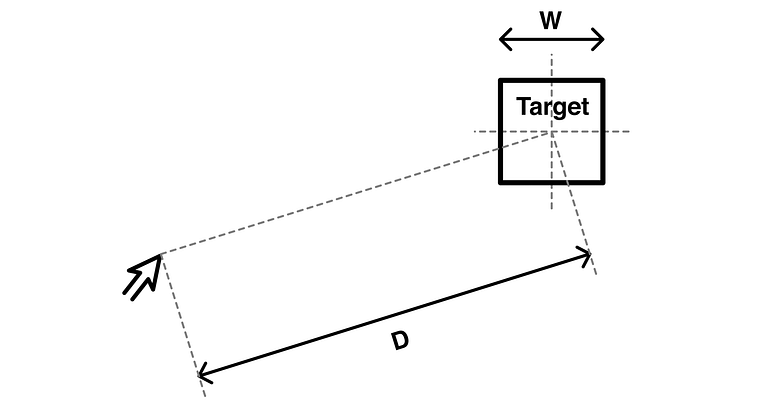
Then there’s Fitts’ Law. Specific to human-computer-interaction (HCI) on desktops, Fitts’ Law predicts that “the time required to rapidly move to a target area is a function of the ratio between the distance to the target and the width of the target” — for example, how large a button is, and how far it is from the cursor’s position in the UI.

Many UX designers forget that Fitts’ Law — as well as many other UX laws — can also be used creatively by placing destructive features in a UI in a difficult-to-reach position — such as a reset form or the “cancel” button on a web form.
It’s important to remember that, typically, Fitts’ Law doesn’t apply to mobile. However, even though there is no cursor to travel to a target location, a designer can use the distance from one tap to another to either impede or assist an interaction. For example, a “logout” icon can be placed at the top of the mobile screen, and the confirmation could come up on the bottom.
A great customer experience is based on trust and meaningful, consistent interactions. Any designer worth their salt must consider cognitive psychology and the effect of their work on their intended audience. For example, if one considers a bank with over 25 million mobile customers it can be easily seen how ignoring the laws of UX could seriously hinder their app’s UX, and consequently affect their bottom line.
Taken collectively, observing these laws of UX can help guide a digital designer toward creating the most effective design for any given product.
Even though they are not actual laws, but rather tried and true cause and effect relationships, UX designers should nevertheless, take notice of the driving forces behind the laws of UX in order to design superior products.
Here Are Some of These UX Laws
(more in the infographic below)
Fitts’ Law demonstrates how to ease interactions through the careful sizing and positioning of interface elements. It states: The time it takes to acquire a target is a function of the distance to and size of the target. It is particularly important when designing buttons and other clickable on-screen elements.
Hick’s Law, or the Hick–Hyman law, named after British and American psychologists William Edmund Hick and Ray Hyman, describes the time it takes for a person to make a decision as a result of the possible choices he or she has: Increasing the number of choices will increase the decision time logarithmically.
Miller’s Law states that the average person can only keep 7 (+ or — 2) items in their working memory. It emphasizes the benefits of “chunking” to ease complex tasks by grouping information related by perceptual features such as types of fruit or parts of speech.
Occam’s Razor refers to the philosophical idea or scientific principle that if two explanations exist for an occurrence, the simpler one is usually the better choice — e.g., one of the fence posts is broken. Either a) a moose ran through it or b) Some screws fell out because it is old. “B” is more likely.
William of Ockham, a Franciscan friar who studied logic in the 14th century, first made this principle, that states, “More things should not be used than are necessary,” well known. The word “razor” is a metaphor —Occam’s Razor gets rid of unnecessary explanations just like a razor shaves off the extra hair.
The Pareto Principle (also known as the 80/20 rule, the law of the vital few, or the principle of factor sparsity) states that, for many events, roughly 80% of the effects come from 20% of the causes.
The Isolation Effect (also known as the Von Restorff Effect) is the tendency to recall something that stands out in a group and afford it more weighting than its peers. It is named after German psychologist Hedwig Von Restorff, who first documented it in 1933.
German psychologist Hermann Ebbinghaus is credited with creating the term “serial position effect.” The serial position effect is the tendency of a person to recall the first and last items in a series best and the middle items worst.
Download this UX Laws infographic as a PDF >>

Laws of UX Infographic
Originally published at www.toptal.com

![Laws of UX [Infographic]](http://bijoumind.com/wp-content/themes/symplex/cache/images/Laws-of-UX1-608x250.jpg)


No Comments on this Post.Be the first