No one likes a negative Nancy, and pessimism never leads to positive outcomes. If you portray a negative attitude, negative results are certain to follow.
This concept of “negativity begets negativity” can also be applied to your landing pages.
If you neglect positive elements in your landing pages, you’re likely to have negative results. That’s why it’s better to accentuate the positive in order to encourage visitors to convert.
1. Be Positive in your Landing Page
- Give your page a face – Which landing page do you think people are more likely to trust, one with photos of the people who make or use the brand’s products or services, or one that just talks about your company? Including photos of your employees or even some of your real customers can help viewers connect with your page. The photos can show customers or employees interacting positively with your product. Even show off behind the scenes shots of their offices for an even more personal feeling. Either way, adding a touch of personality to your landing page will give them confidence in your brand and help increase conversions. A recent customer of ours testing customer imagery versus product imagery and converted significantly higher with customer imagery. The immediate connection that the visitor makes to someone relatable, familiar, or similar can produce significant impact on your business objectives.
- Positive copy – Positive copy sells. There is a fine line between just writing fluffy, feel good prose and emphasizing key points. Be sure to use copywriting best practices to really bring a positive image with your landing page. Focus on the pain points of a visitor and how your product or service will solve their problems. Provide them with benefits and why they should accept your offering. Even your call-to-action should tell them how downloading your White Paper, or attending a demonstration would positively affect their life. Even your call-to-action should tell them how “downloading” content, “learning more”, or “buying now” would positively affect their life.
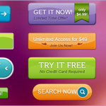
- Warm and inviting colors – When you land on a monochrome page without vibrant, inviting graphics, do you stay around? Usually not. That’s why you should accentuate positive colors in your landing page design. For instance, instead of black buttons or dark red backgrounds that can cause anxiety, try a bright green or blue, which are typically calming colors. Creating a peaceful and inviting experience is always a good rule to follow. Create an environment that the visitor enjoys spending time in. You have the control of every emotion your visitors feel while accessing different landing pages, use this to your advantage.
2. Provide positive proof
Just like you add a face to your landing page, putting in testimonials can make visitors breathe a sigh of relief. How? They see customers who have had success tied to your offering, and it provides a sense of trust. For effective testimonials, try adding short videos of satisfied customers or written testimonials with compelling photos.
3. Create a Positive Landing Page for Higher Conversions
When people feel good, they tend to take action. So, it’s important to include positive elements in all of your landing pages. From warm colors to benefit driven copywriting, more positive elements will compel visitors to opt-in to your offering. Remember to always create an environment that the visitor enjoys spending time in.
Do you need help adding positivity into your landing page? Leave us a comment and let us know!


OUr company was already off to a great start with our online marketing. However, we still needed search-optimized landing pages for a strong internal linking strategy. BijouMind worked with our editorial team to come up with custom copy and layout for our best landing pages.
The results of their changes are apparent in our monthly analytics metrics. Three months after the update, organic traffic was up 135% and ranking on page 1 in Google. People weren’t just finding the page more often in organic and paid search, but they were also taking the time to read the content and convert to a paid customer on the updated landing page.
At the end of the project, they helped us understand through FREE training how to add custom content for our target audience. We’re referred several of our clients to them as well.