As the leaves fall and the air becomes crisp, online shoppers begin to think about shopping for the holiday season. If you’re a eCommerce businesse owner, you should start planning on how to cater to those shopper’s desires and joys.
The holiday season will be the time when consumers spend the most money online than ever before; it’s also the time when they have the most buying options. That’s why it’s crucial a website reflects a quality user interface that brings out users’ holiday enjoymenty, while still remaining a user friendly and clutter-free space that they can easily purchase froms.
Refresh Your Product Descriptions and Marketing Content
Outdated content and product information that doesn’t apply to the time of year only takes away from the user experience, as well as the desire to convert on your site. Update your content to stir up feelings of yuletide cheer and encourage sales.
Highlight certain products
It’s only practical to make available products that users will need based on the time of year. Anticipate what they’ll be looking for, and highlight them by prominently displaying them on your home or product pages. You can also offer special holiday deals to encourage more sales on seasonal products. Create concise calls-to-action so that users know exactly what kind of deal they’re getting and how to get it. Amazon’s holiday ecommerce tools can help you decide how best to drive traffic to your top sellers.
Emphasize how your brand benefits users during the holidays
Set yourself apart from the barrage of cliché holiday language that users come across all the time, and instead offer real value to consumers. Adapt your website copy so that it accurately describes why users need your brand. Whether you’re offering clothes or specialty items, explain why they’re perfect for staying warm in the winter, or can be bought as gifts specifically for loved ones.
Keep your layout and navigational system clean and simple, much like you’d want to see in a brick and mortar store. The least amount of clutter will satisfy your users, and will make it easier to add a little holiday sparkle to the site without overdoing it.
Create gift guides or categories
Users want to experience the least amount of hassle in their online shopping as possible – especially around the holidays. Make the process simple for them by categorizing your site with useful themes like “Top Holiday Sellers,” “Gifts For Dad” and “Gifts Under $50.” This helps guide users to items they’re looking for, and might even entice them to purchase more than they came for.

Develop Themed Landing Pages
One way to draw attention to a special product or service is to create a unique and engaging landing page dedicated to it. Rather than using gaudy holiday clipart and overused colors, make the page unique by staying true to your brand messaging while adding a touch of creative holiday imagery and copy. The page doesn’t have to be decked out in holiday-themed elements in order to reflect the essence of the season.
Promote user interest and engagement by offering a single and simple call-to-action for the page. Users should know exactly what will happen when they choose to convert, and a simple process will build confidence in their decision. Allow them to share their experience through social channels by including sharing buttons to show their friends.
Renew Your Social Media
In the interest of retaining brand consistency, it’s important to also update your social channels for the season. It would be confusing to see your holiday themed website but just your same old Facebook page; users should be able to recognize your brand across all channels and see that you’re committed to bringing the benefits of the holidays to them in every way possible. This can be as simple as updating your Twitter header photo to echo the seasonal merriment.
Add content to your social media sites that will add value to your users’ experience. Consider starting conversations through these channels about gift giving and holiday memories to engage users and their holiday spirit. Create Twitter hashtags to spread awareness of your seasonal deals and promotions.
Go Mobile
If you haven’t already, develop a mobile site to coordinate with your main website to reach a wider audience. More and more users are eager to conduct their online business through mobile means, and are looking for fast and convenient sites to visit while on the go. Optimize your mobile site and decrease friction to build reliability in your brand.
Simplify
A mobile site should be simpler than a full website; after all, it’s being viewed on a smaller screen and interacted with through touch capabilities. Simplify its design by reducing the number of pages and navigational steps in the site, eliminating unnecessary copy and utilizing a clean and minimal layout.
Promote your brand message
Stay consistent by carrying out the same branding elements from your standard site to your mobile site. This reinforces your brand message and promotes a feeling of comfort and confidence among users already familiar with your brand. Users should also be able to easily switch over to your full site from the mobile one.
Switch Up Your Keywords For SEO
Insert new product descriptions and keywords and phrases to most accurately illustrate your holiday items and to make them easier for users to find. For example, if a user is searching for a “Pink Dress” for a Halloween costume, it becomes easier to find if listed under “Pink Princess Gown.”
Holiday Website Successes
Land’s End

This site adds holiday elements in simple and subtle ways to bring out the comforts of the wintry season. By adding texture, an illustrated gift to highlight the seasonal section and hosting a picture of the brand’s products in everyday (and current) use, the user effectively gains a sense of the festive value that Land’s End offers.
Citizen Effect

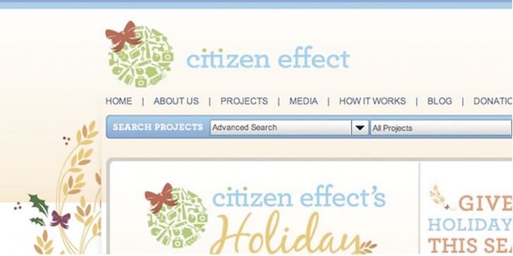
This site broke out of holiday clichés by using a color palette that reflects the natural side of the time of year, rather than the red and green typically seen. The designers also got creative by tweaking the logo to look like an ornament, showing a willingness to go the extra mile to bring the holidays to the brand message.
Getting Started
Use these tips as you begin your own website preparations for the holidays. Just remember to retain your branding and site usability. Nothing you change should negatively affect the functionality of your original site, but should instead add value to your site and the experience your users have with it.


No Comments on this Post.Be the first