
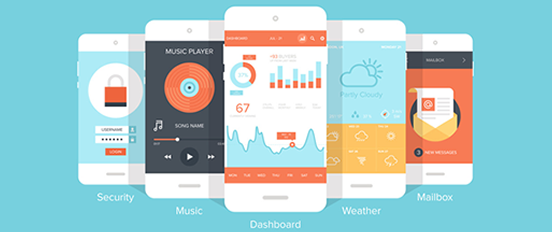
7 Best Practices for Designing a Mobile User Experience
In the last 3 years desktop Internet usage has fallen from 90% to 60%, while mobile usage has increased to 40%. Following this trend, mobile devices are set to upstage desktop Internet access soon. Very soon.

Image from StatCounter
The challenge in designing for mobile devices is that they come in so many variants, sizes and flavors. Much like Browsers during the great Browser wars of the 1990′s!
In the interest of a better, more intuitive and user friendly mobile experience, let’s take a closer look at some of the best practices to keep in mind for mobile designs:
1. Have Clear, Focused Content
2. Menus and Navigation: Keep It Simple
3. Create Fluid Layouts
4. Design for Touch
5. Keep Forms Minimal
6. Drop the Images
7. Leverage Mobile Specific Features
Mobile devices have many features like GPS, Gyrometers and other sensors that are not available on desktop devices, such as “slide to unlock” or the ability to make phone calls. Figure out how to use these features to make the mobile experience for your website even better. You can add simple features like “Tap to Call” the phone number on your contact page, enable easier sharing across social media platforms, or GPS to offer location specific information and services.
This is the part where you stretch yourself to think out of the box and leverage mobile specific functionality for a better mobile experience.
If you’re keen on learning more about mobile designs, here are some great resources to explore:
Are you already following these best practices? What are your favorite tips to designing a good mobile experience?


No Comments on this Post.Be the first