
When it comes to website and application design, one of the more important decisions to make involves choosing the right colors. It’s a choice that can make or break a project, especially when we consider all the moving parts that go into creating a successful app or site.
That’s why it’s important our websites and applications’ color schemes are planned, intentional – and most importantly – optimized for conversion.
Why is Color Important?
Color plays an important role in our everyday lives. It connects to our feelings in a unique way, making it a powerful marketing tool to harness when making design decisions. Our color choices should reflect the message we want to share about our upcoming event or product. Usually, color is the first thing that will draw the eye and visually guide our users and visitors, which is why it’s important that the colors in our designs are purposeful and have meaning in their use.
According to a Kissmetric’s infographic, 85% of shoppers base their decision on color alone. Proper use of color leads to an 80% increase in brand recognition. Various other studies and tests have proven that color can increase memory, engage and increase participation, as well as inform.
How is Color Important?
Contrast
In layman’s terms, contrast is the difference between two colors. Contrast serves two functions in design: it establishes readability as well as draws the viewer’s attention towards a specific element on the screen. When in doubt, the best practice is to choose a very light color for the background and a very dark color for the text itself.
Complementation
Complementary colors are found opposite each other on the color wheel. For example, red’s complementary color is green and blue’s complement is orange. When used correctly, these colors can accent each other and make a very effective color scheme.
Vibrancy
This refers to the general mood particular color sets: the brighter, warmer colors (red, orange, yellow) tend to energize us while darker, cooler shades (green, blue, purple) tend to be more relaxing and tranquil.
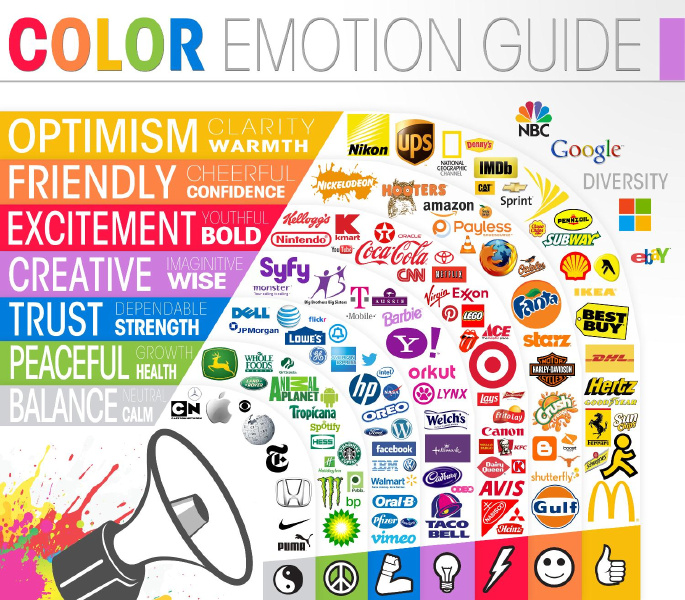
The Psychology of Color and Conversions
Learn more: http://www.colorcom.com/research/why-color-matters


No Comments on this Post.Be the first