
The Brilliance and the Bother of the Hamburger Icon
Originally created by Xerox product designer Norm Cox in 1981, the hamburger icon was originally designed to simply indicate a list within the Xerox “Star” system.
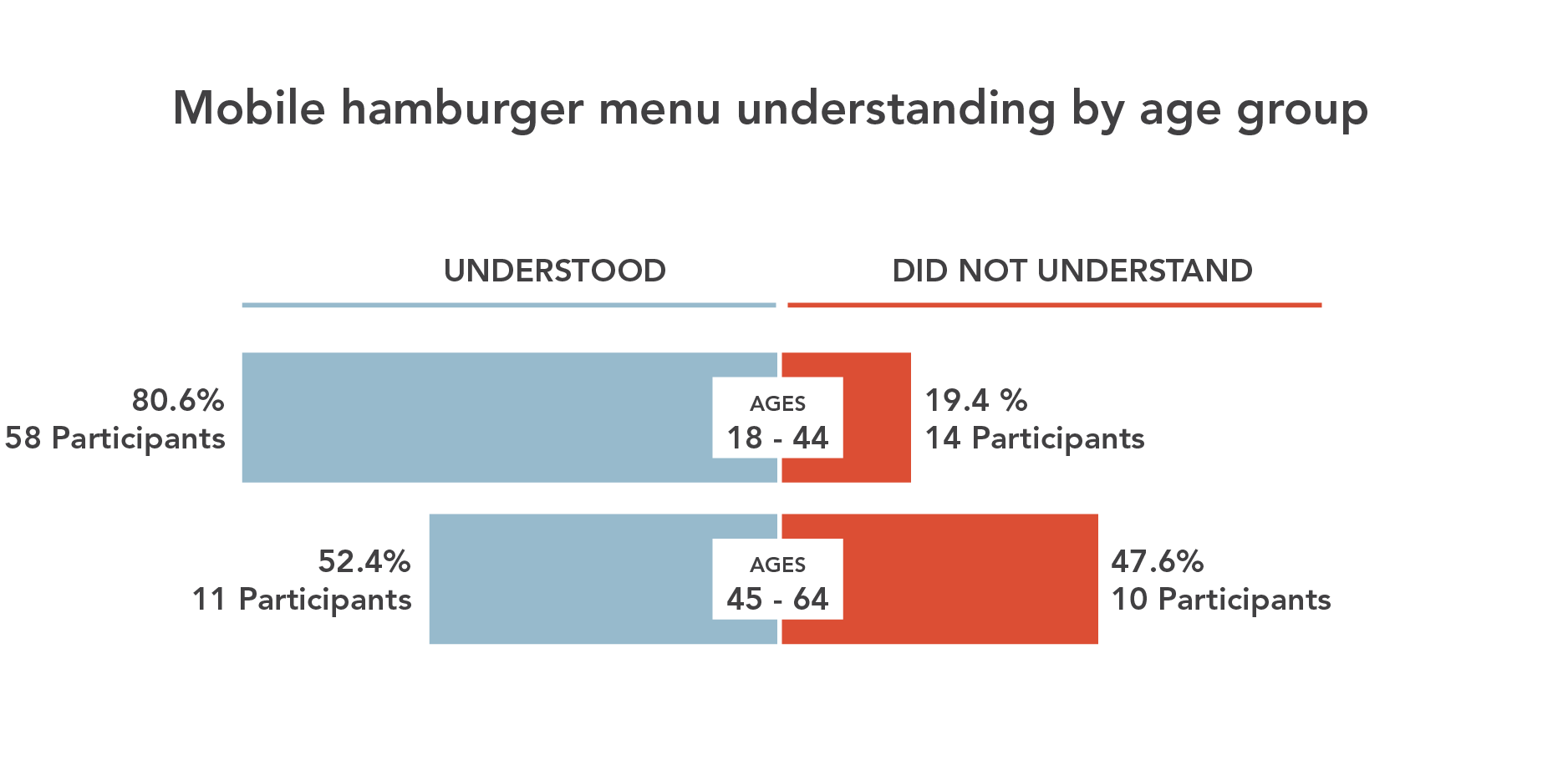
Human Computer Interaction theory, A/B tests, and the evolution of the top apps in the world all support the same thesis: The hamburger button is bad for engagement and you should probably replace it with a tab bar or other navigation scheme.
Essentially, what’s out of sight is out of mind. Any navigation options hidden behind the hamburger will be forgotten, or at least used a lot less. It doesn’t help that the button is often placed in the top left corner the hardest place to reach when using the phone with just your right hand.
- Less efficient since you have to tap once before you’re allowed to see the option you want.
- Clash with the navigation patterns of many mobile apps, forcing you to swipe or ‘back’ through multiple screens just to arrive at the hamburger button.
- Less glance-able, preventing you from seeing specific areas of an app such as notifications, messages, or new content without first opening the side menu.
The Brilliance and the Bother of the Hamburger Icon
THE SOLUTION: THE TAB OR ACTION BAR
The tab bar is a row of persistently visible buttons typically at the bottom of the screen that open different parts of the app.
1. State can be directly presented on the tab bar
2. Items are always visible and instantly accessible
3. No navigation gesture conflict
Instead of hiding the navigation options in a drawer, you splay them out. This keeps users from forgetting they exist, makes multiple pieces of core functionality available with one tap, allows rapid switching between features without the need to retreat to the app’s home screen, and lets you display notifications on each tab.
That little three-lined button is BAD. Whether you call it a side menu, navigation drawer, or a hamburger, hiding features off-screen behind a nondescript icon in the corner is usually a poor UI design choice.


No Comments on this Post.Be the first